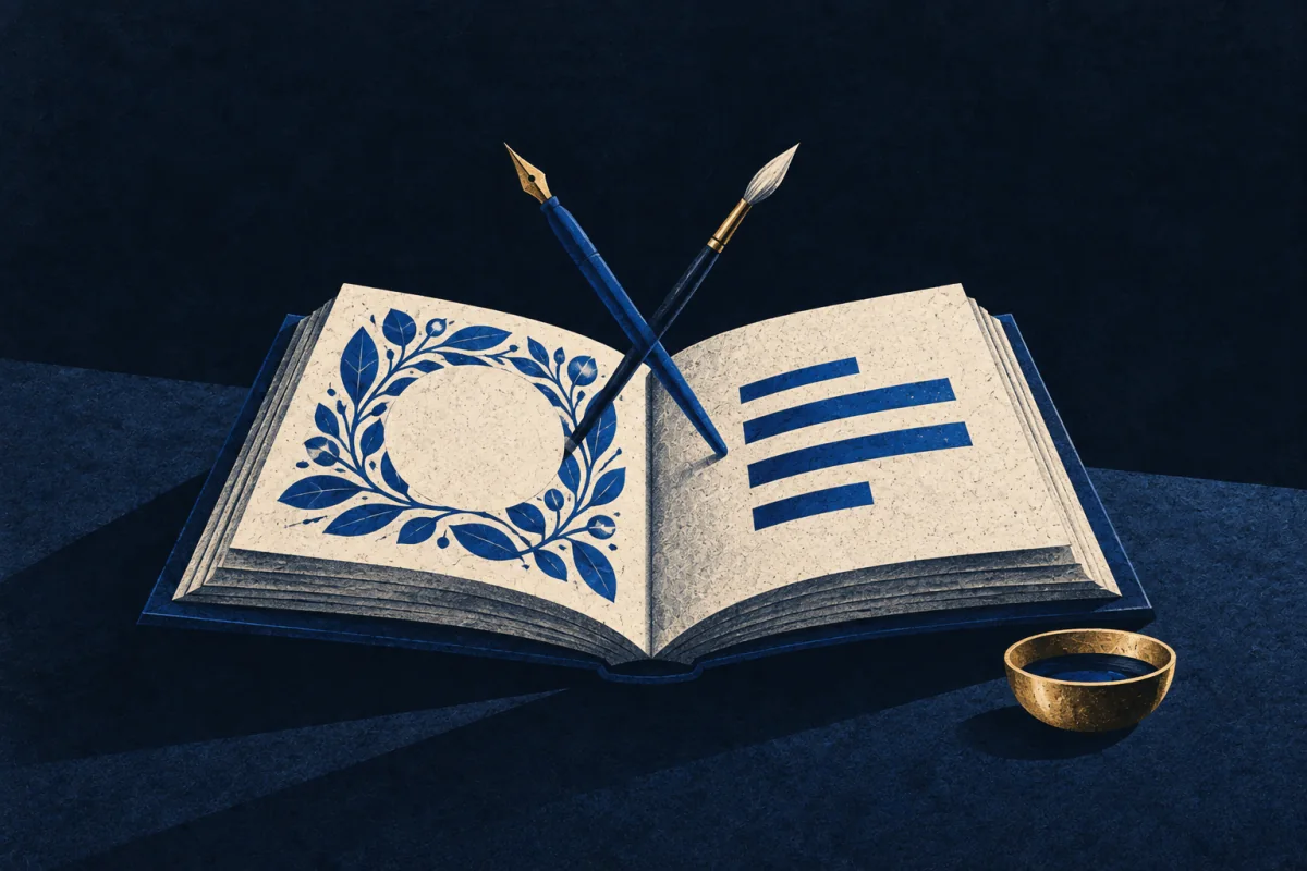
In Plain Sight
Some people build a page where the words and the picture are one job. The layout tells the reader where to look, the drawing carries part of the meaning, and neither could be lifted out without the other collapsing. It is not decoration. You'd notice this in whoever redraws a birthday card twice so the message and the picture finally fit.
The Pattern at Work
The page is treated as a single object rather than as text with something added. Most people write, then illustrate, then arrange, and the three decisions are made by three different sets of instincts in that order. Somebody with this pattern is making them together, so a sentence gets rewritten because it is the wrong length for the space, a drawing gets moved because the eye lands there first and that is not where the meaning starts, and a word gets used twice because the shape of the repetition guides the reader down the page.
What drives all of it is the route the eye takes. A reader arrives at a page and moves through it in an order they do not choose, decided by size, weight, colour and the direction of anything drawn on it. That route either matches the sense or fights it. Somebody good at this can look at a finished page and say where the eye goes first, second and third, and will rebuild it when the answer is wrong, even when every element on it was fine on its own.
The hand is part of the method. This is mostly made rather than specified: ruled, lettered, drawn and corrected at the actual size, because the judgement is about a physical object seen whole. Working at scale on a screen is possible and is a translation of the instinct rather than its native form.
And the corrections are invisible. The version that works looks like it arrived that way.
What the Examples Show
It gets read as neat handwriting, or as decoration, or as somebody being fussy about presentation.
The first element is that words and image are one decision. The text is altered to suit the layout as readily as the layout is altered to suit the text, which is the move most people never make.
The second is that the subject is the reader's eye. Size, weight and direction decide the order things are seen in, and the page is judged by whether that order matches the meaning rather than by whether it looks balanced.
The third is that it is built at full size by hand. The judgement is about a whole physical object, so the work is done as an object, and the corrections disappear into the version that finally holds.
Going Deeper
Pages where the writing and the image are the same job are the norm across most of the history of the book, and the plain page is the innovation.
Insular manuscripts such as the Book of Kells built pages where a letter becomes an animal and the text cannot be separated from the ornament without losing the page. Persian and Mughal albums set painting and calligraphy on one surface as a single composition, with the poem's placement doing real work. Chinese and Japanese practice went further, treating the brush that writes and the brush that paints as one instrument, with the seal and the inscription part of the picture's balance. The tradition thinned when movable type separated the two trades, and came back through Blake, through the Arts and Crafts books, and now through comics, picture books and information graphics, which are the largest living version of it.
The costs are those of a hybrid skill in a world organised by specialism. The work is slow, and slow work is priced against fast work rather than against its result. It falls between departments, so an illustrator is briefed to decorate text somebody else fixed and a designer is given words that cannot be changed, and both arrangements produce the thing this pattern exists to avoid. It is fragile to editing, since a page built as one object breaks when a sentence is added late by somebody who cannot see why that matters. And it is dismissed as decorative by people who read only the words, which is most people.
The Image
Rewriting the sentence to fit the drawing.
You have a line you are pleased with and a picture that is right, and together they do not work.
Everybody's instinct is to move the picture. The move that makes the page is to change the sentence — three words shorter, so the shape of it sits under the drawing and the eye falls from one into the other. Nobody reading it will ever know a sentence was sacrificed. They will only notice that the page is easy.
Where It Stops
Good handwriting is not this, and neither is liking beautiful books. The test is whether the words ever get changed to serve the page, because that is the exchange most careful people will not make.
It goes wrong as decoration for its own sake. A page can be elaborate enough that the reading slows down, and the elaboration then costs exactly what it was supposed to buy. Ornament that does not direct the eye is in the way.
It also fails where the text belongs to somebody else. Legal, technical and liturgical material has to be set as written, and the instinct to trim a line for the sake of a shape becomes a serious fault.
Take the plainer explanation first. Anybody making a card or a poster arranges things until they look right. The test is whether they can say what order the eye moves in and why.
Where It Pays
Inside a job. Book design and illustration, picture books and comics, information and editorial graphics, lettering and calligraphy, greetings and stationery, exhibition panels, certificates and ceremonial documents, and the visual side of teaching materials. Also manual and instruction design, where a page has to be understood by somebody holding a tool.
What is being bought is comprehension without effort. A teaching page where the eye arrives in the right order teaches faster than the same content set plainly, and the difference is largest for readers who are struggling: children, people reading in a second language, anybody tired or in a hurry. In instructions it is measurable in errors, and in exhibition work it decides whether anybody reads the panel at all.
Where it pays badly is in how the role is drawn up. The word and the image are usually two budgets and two suppliers, so the person who can do both is hired to do one, at the rate for that one, and the integration is done unpaid because they cannot help it.
Outside one. Families, schools, clubs and congregations, wherever a notice, a card, an order of service or a programme has to be made. The cost worth naming is that this person ends up making every certificate anybody in the building ever needs.
Try This
Take something you need to write on one page. A notice, a card, an invitation, a single page of notes.
Draft the words first, then put them down and ask a different question: where will the eye land first, and is that where the meaning starts.
Now change the words to fit the answer. Cut a line so a shape works. Move a heading because the eye was going there anyway. Do not add anything.
Hold it at arm's length and check the order again. That is the whole test.
Building the page as one object is a tool, not a self. Pick it up where a reader has to take something in quickly and whole. Set it down where the wording is fixed by somebody else, because there the instinct to trim a line becomes damage.
If This Isn't You
Plenty of people type the words, drop in a picture, and get on with their day, and the notice does its job. Not seeing the page as an object is not a lack of care; it usually means the words were carrying it.
Where To Go Next
Its near-twin — Print-Hand. Both make pages by hand with words on them. Print-Hand is producing a run of identical copies and its problems are ink, register and repetition. This one makes a single page and can change the text on it at any point.
Its shadow — Line-Answering Hand. Line-Answering Hand draws for itself, following the mark wherever it goes, with no reader in the room. This one is built entirely around a stranger's eye and gives up any line that does not serve it.
Most often confused with — Picture-Teacher. Both use image and word together to make something understood. Picture- Teacher draws live, in front of people, and the drawing is over when the lesson is. This one makes an object that has to work later, without them, for somebody they will never meet.