In Plain Sight
Some people can flatten a landscape onto paper so that a stranger can use it. They are not drawing what it looks like. Scale, direction and what sits next to what are chosen so the ground can be recognised on arrival. You'd notice this in the one whose napkin sketch gets strangers to the door first time.
The Pattern at Work
The napkin has six lines on it and no scale. It shows a petrol station that is not the nearest landmark and is the one that will be visible at night, a church that can be seen from three hundred yards, and a turn drawn at an angle that is wrong on the ground and right in the head, because the turn feels sharper than it is and a driver expecting a gentle bend will miss it. Nothing is accurate. Everybody who has used it has arrived. A surveyed plan of the same two miles, printed properly, gets people lost at the same junction every time.
A footpath map for a nature reserve goes through four versions. The first is the estate's own plan, which is correct. The fourth has the stream drawn much wider than it is, because the stream is what tells a walker they have gone too far, and the gate that everybody misses is drawn larger than the car park. Two features are left off entirely: a ruin and a pond, both real, both useless for navigation, both of which had been causing people to stop and doubt themselves.
A hand-drawn map of a village for new residents takes an afternoon to make and puts the bins, the doctor and the bus stop on the same sheet as the footpaths, because a person who has just moved needs all three and no official map carries them together. It is photocopied for seven years. The replacement, professionally produced and geographically correct, is worse, and within a year somebody has pinned a copy of the old one next to it.
What the Examples Show
It gets read as drawing skill, or as knowing the area well, and neither of those produces a usable map. A good draughtsman with local knowledge will make something accurate and unusable.
What is running is a translation with a purpose attached. The ground has infinitely more in it than a sheet can hold, so everything depends on selection — what goes on, what comes off, what gets exaggerated — and the selection is made against a question: what will this person need to see, at the moment they need to decide, in the conditions they will be in.
That is why accuracy gets sacrificed deliberately. A stream drawn wide, a turn drawn sharp, a landmark drawn out of proportion: all of those are errors on a survey and corrections on a map, because they encode what the user has to notice rather than what is there.
And it requires having walked it. The napkin is made by somebody who has missed that turn themselves.
Going Deeper
Every mapping tradition has had to settle the same argument between accuracy and use, and the useful ones have generally chosen use.
Polynesian stick charts show swell patterns and island relationships and nothing that looks like a coastline, because swell is what a navigator can perceive. Portolan charts were built from compass bearings and sailing distances rather than from any survey. Harry Beck's underground diagram threw away geography entirely and is still copied worldwide, because a passenger needs order and connection rather than distance. Inuit carved wooden coastal maps that can be read by hand in the dark, which is the condition under which a coastline most needs reading. Ordnance Survey and its equivalents went the other way entirely, toward accuracy, and produced something magnificent that most people cannot use without being taught how.
The bill is a peculiar one and falls in the same place each time.
A map that works is judged by people who do not know what they were spared, while a map that fails produces somebody lost and annoyed, so the feedback is entirely one-sided. The distortions that make it work are also indefensible to anybody who checks them against the ground, and the person who made it is frequently asked to correct exactly the errors that were doing the work. And the knowledge behind it is local and perishable: a map built on a petrol station is one closure away from being wrong, and the maker is usually the only person who knows which of its features are load-bearing.
The Image
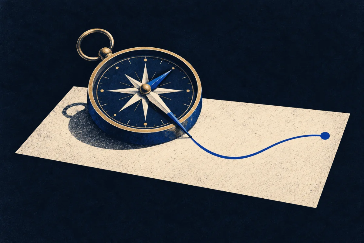
The stream drawn too wide.
It is not a mistake. It is the feature that tells somebody they have gone too far, made big enough that they will see it when they are tired and half paying attention.
Every useful map has several of these. Every accurate map has none of them, which is precisely why accurate maps get people lost at the same junction, year after year, and nobody blames the map.
Where It Stops
Being good at directions is not this. Plenty of people can navigate faultlessly and cannot produce anything another person can follow, because what they are holding is a route rather than a picture.
It goes wrong as never being accurate. The distortions are licensed by purpose, and a habit of drawing what is useful can drift into drawing what feels right, at which point the map becomes a personal document that only works for people who already know the way.
It also fails where precision is the requirement. Boundaries, drainage, legal plans and anything measured need the survey, and a map made by this method in those settings is worse than useless.
Take the plainer explanation first. Anyone who has worked a delivery round or guided a group makes rough maps because it saves time. The test is whether the result works for a stranger, which is a much harder test than it sounds and which most hand-drawn maps fail.
Where It Pays
Inside a job. Cartography of the applied kind, wayfinding and signage, trail and reserve interpretation, guidebook and route publishing, emergency and utility mapping, transport diagrams, and the visual end of any work where somebody has to act on spatial information under pressure. Also interface and dashboard design, which is the same problem with different terrain.
What is being bought is fewer wrong turns, and the saving is invisible because it lands as an absence. Every organisation that sends people to places has a junction where its visitors get lost, and the cost of that appears as late arrivals, phone calls and complaints that are never traced back to a drawing. One person who has walked it and drawn what matters removes the junction entirely.
It pays badly wherever accuracy is the specification, badly under any process that reviews a map against a survey, and badly in organisations that want their own names on it rather than the visitor's landmarks.
Outside one. Directions, village maps, walk descriptions, a sketch for somebody coming to stay. The cost worth naming is that the work is assumed to take five minutes and generally takes an afternoon, and nobody who receives it will ever know that four things were deliberately left off.
Try This
Draw the way to your house from the nearest main road, for somebody who has never been.
Then give it to somebody who has actually never been, and do not explain anything. Watch what they ask about.
The questions are the map's real content. Almost always they are about a decision point you did not think of as one, and almost always you left off the thing that would have settled it because it was too obvious to draw.
Redraw it once, with that thing on it and two accurate features removed.
The stream drawn too wide is a tool, not a self. Pick it up where somebody has to act on where they are. Put it down where the drawing has to be right because a boundary or a measurement depends on it.
If This Isn't You
Most people send a pin, follow the arrow, and arrive perfectly well, which is what the phone is for. Feeling no urge to redraw the footpath sign is an answer, not a passivity.
Where To Go Next
Its near-twin — Trail Sign Mapper. Both hold ground in mind and both work from having walked it. Trail Sign Mapper builds a moving picture for itself and follows something into it. This one builds a fixed picture for a stranger and will never meet them.
Its shadow — Sign-Caster. Sign-Caster writes the instruction for the person standing at the junction. This one draws the whole relationship, so that somebody can work out their own instruction at a junction nobody anticipated.
Most often confused with — Field-Naturalist. Both read landscape closely and both record. Field-Naturalist records in order to understand what is happening there. This one records only what will help somebody get across it, and leaves out the interesting parts on purpose.